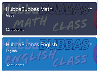
Every year my homeroom chooses their class name, and I like to incorporate it into their Google Classroom; however, it’s a pain sifting through the millions of images that “don’t fit.” That’s why I just make my OWN!
This Reader’s Workshop image is for my Forms. I sometimes even put directions in the image to save space. Plus, it looks adorbs. ❤️
Adobe Spark is amazing! People also use canva, but I like Spark better for instagram, too! Anyway, you choose your custom image, and viola! You can have a personalized classroom, form, heading, etc.
For forms and classroom, the size you want is 1600x400. You can choose this size in the custom area. Next, be careful of the sides of the image for classroom if you don’t want anything blocked. On Google Classroom the bottom left and right sides have some text on there, so you want to adjust your images so you can see it perfectly. That is why there is “blank” space on the sides of the very top image.
If you want to get super fancy, you can adjust some more blank space so that the Mobile App looks amazing... I wasn’t that concerned, so this is what it looks like not adjusted.
As you can see, Google’s text gets in the way, but it still looks really nice. The best part is, as you may know, once you input an image for Forms or Classroom, it automatically chooses a theme color to support it. I am NOT an artist. I do not have my color wheel down, and I need help choosing colors, so I LOVE that Google does it for me!
Adobe Spark has a free account. You will just have their Logo on the bottom. You can get a free account for 30 days, make ALL THE IMAGES, and then cancel? I’m not being endorsed by Spark, so, you do you.


No comments:
Post a Comment